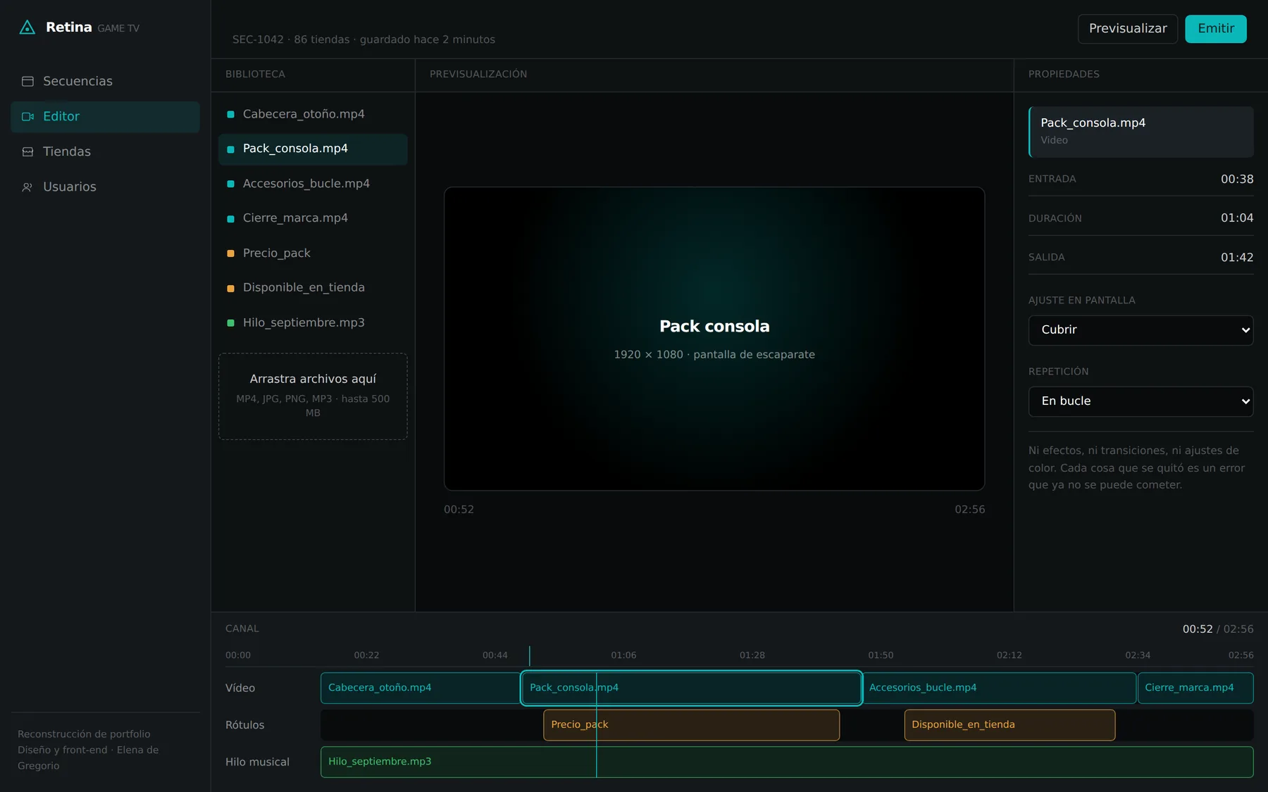
Work / Front-end / GMF Reformas · The new website
A website that lives up to the best reputation in town
Project 10 of 30 in the archive 01 of 10 in Front-end development See the whole discipline ↗
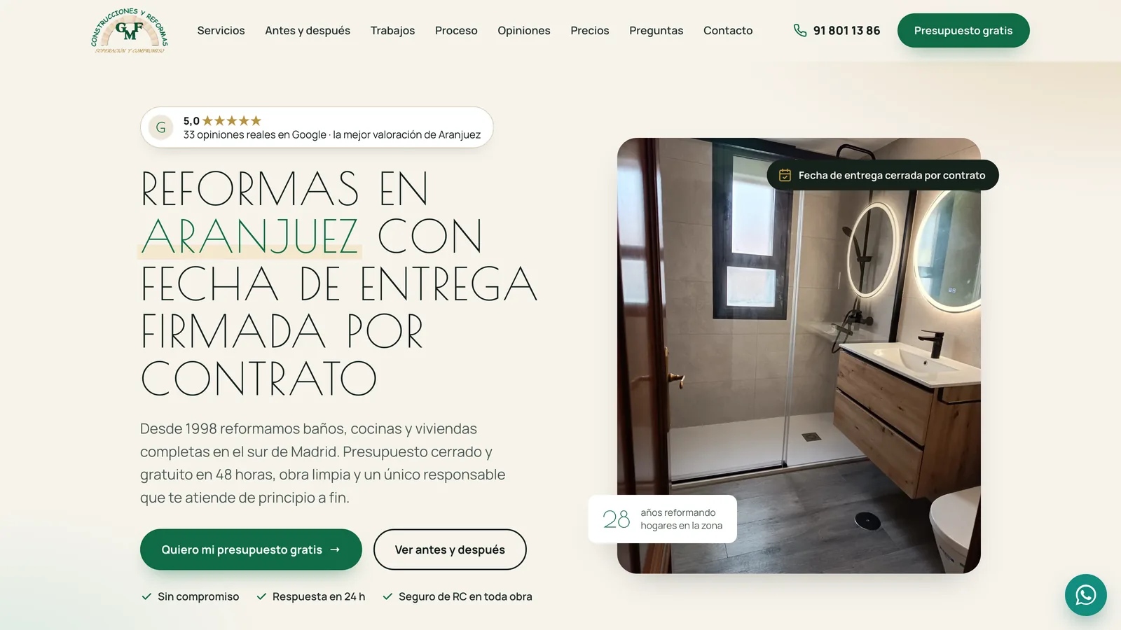
It is hosted on this very domain, as a private preview, for the client to review
While GMF decides what changes and what stays, the site is not public: it lives in a folder of this portfolio, is not indexed and asks for a password before showing anything. If you have it, the button takes you in; if not, you will see the door and nothing else. The captures below tell the rest.
Thirty findings, an approved design and zero libraries
The previous site was a four-page Google Sites: not one button or clickable phone number outside the contact page, a Google Form embedded in a third-party iframe as the only form, and a platform that does not let you insert a single line of measurement. The digital audit sorted that into four blocks —conversion, competition, customer and accessibility— and thirty findings, starting with the ones that cost nothing. What sold GMF was not on its website: it was in its reviews.
Phase 1 took that to Figma —the site's UX/UI design, in high fidelity— and the client approved it. Phase 2 is turning that design into a website that can be published on an ordinary shared host, with no frameworks, no content manager and no dependency that can expire: hand-written HTML, CSS and JavaScript, plus a single PHP file to receive the form. What the client pays for is the website, not a subscription.
Static pages
Home, six service pages, thank-you, 404 and three legal pagesThird-party libraries
No jQuery, no framework, no plugin: 101 KB of hand-written CSS and JSaxe-core issues
WCAG 2.1 A/AA across all twelve pages, desktop and mobileLighthouse on desktop
Performance 100 · accessibility 100 · best practices 96 · SEO 100. On mobile, 91 for performanceThe identity comes from the brand; it is not invented here
The green and the stone of the arch come from the logo; the gold of the motto “Superación y compromiso” stays decorative because on a light background it does not reach the required contrast, and for text there is a darker gold that does. Headlines are set in Poiret One, uppercase and letter-spaced, and since that family exists in a single weight with no italic, emphasis is marked in green with a gold underline rather than with a bold that does not exist. Body text is Manrope at an 18-pixel base.
A home page that sells what the reviews already said
The home page walks, in the order a customer decides, through what the audit had identified as the argument: the Google rating at the very top, the delivery date signed by contract in the headline, five written guarantees, the six types of work, before and after, real jobs, the five-step process, the reviews, starting prices, the service area and the questions everyone asks before renovating. And at the end, the form.
The years in business are not typed in: they are computed from 1998, so the site does not go stale every January. And the figures show with JavaScript off, which was a bug in the previous version: a “0” used to appear.
01 · Six services, six pages, one source
Every card in “What we renovate” opens its own page: bathrooms, kitchens, full renovations, lofts and roofs, pools and outdoors, accessibility. All six share the same structure —a hero with a photo, what is included, before and after, a gallery, timings and price, questions, other services and the form with the renovation type preselected— and all six come out of a single Python file that describes each service and generates them.
The home page works the same way: it is written in a source HTML with three macros —IMG, CMP and GAL— and the generator turns them into <picture> elements with three widths, into comparators and into gallery cards, reading each photo's real size to write its width and height. Nobody types a srcset by hand, which is why none of them is wrong.
_src · build.py · servicios.py · index.src.htmlPillow reads the dimensions · 418 image files generated
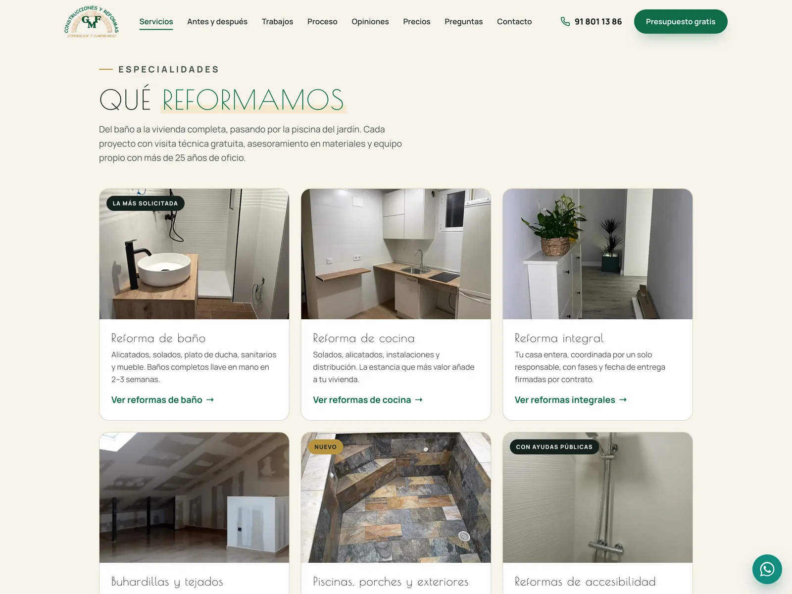
servicios.py, with the form preselected02 · Before and after, with a control that understands the keyboard
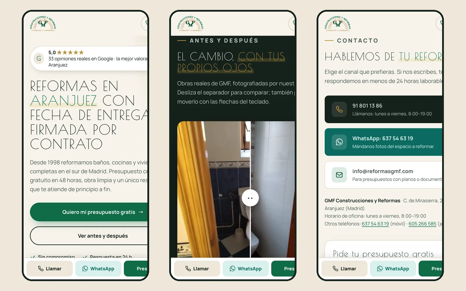
Eight comparators of real jobs, four in view and four more on request. Each one is an invisible <input type="range"> covering the photo: it works with the mouse, with a finger and with the arrow keys, and it tells the screen reader where it is. There is no comparison library; there is a native control, well placed.
When it enters the viewport, the divider moves on its own once. That is the hint that it can be dragged, and it never does it again. With “reduce motion” on at system level, not even that.
js/main.js · comparatorsOne native range per photo · keyboard and screen reader
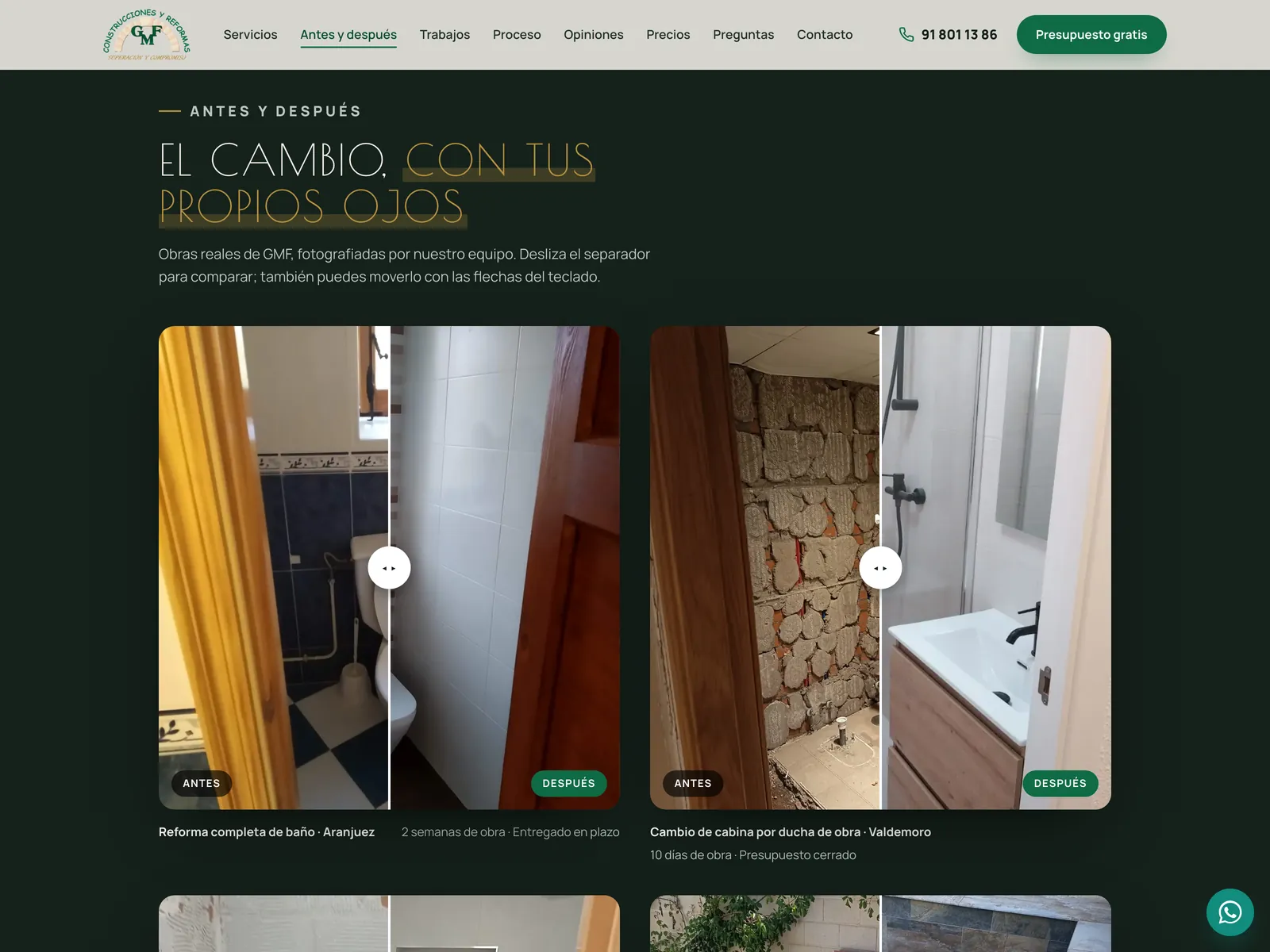
range: mouse, finger and arrows03 · Real work in real homes: the gallery and its viewer
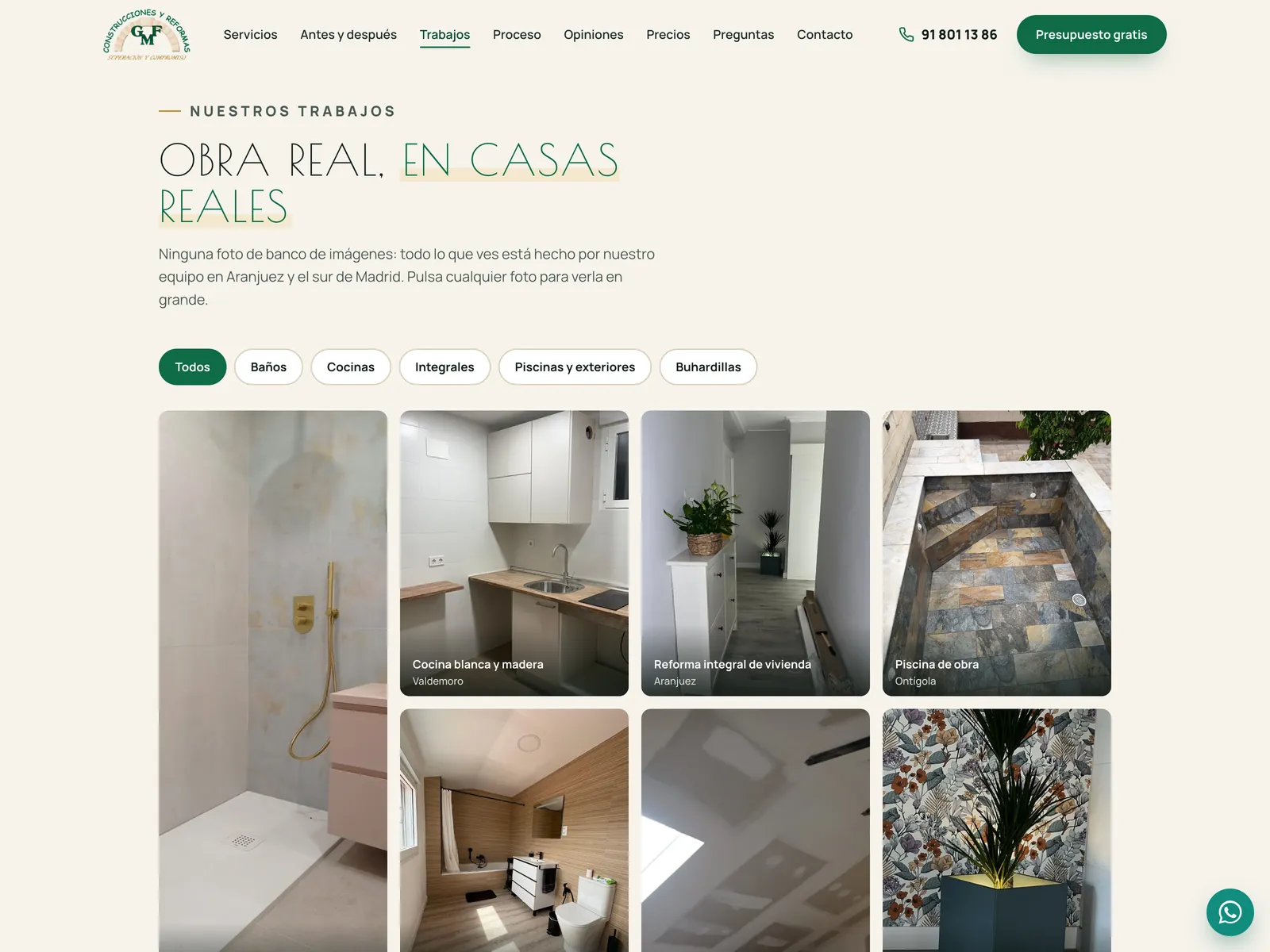
The audit said it plainly: for a renovation company, the photo is the argument. Twenty-one photographs of the company's own work, none from a stock library, with filters by type —bathrooms, kitchens, full renovations, outdoors, lofts— and a viewer built on a native <dialog> that traps focus, closes with Esc and moves between photos with the arrow keys.
And they weigh what they should: every photo exists in three widths —480, 960 and 1,400 pixels— and two formats, WebP with a JPG fallback, with its dimensions written so the page does not jump while loading. The only image that does not wait is the hero, which is preloaded.
index.html · gallery · js/main.js · viewer21 photos · 5 filters · <dialog> with trapped focus
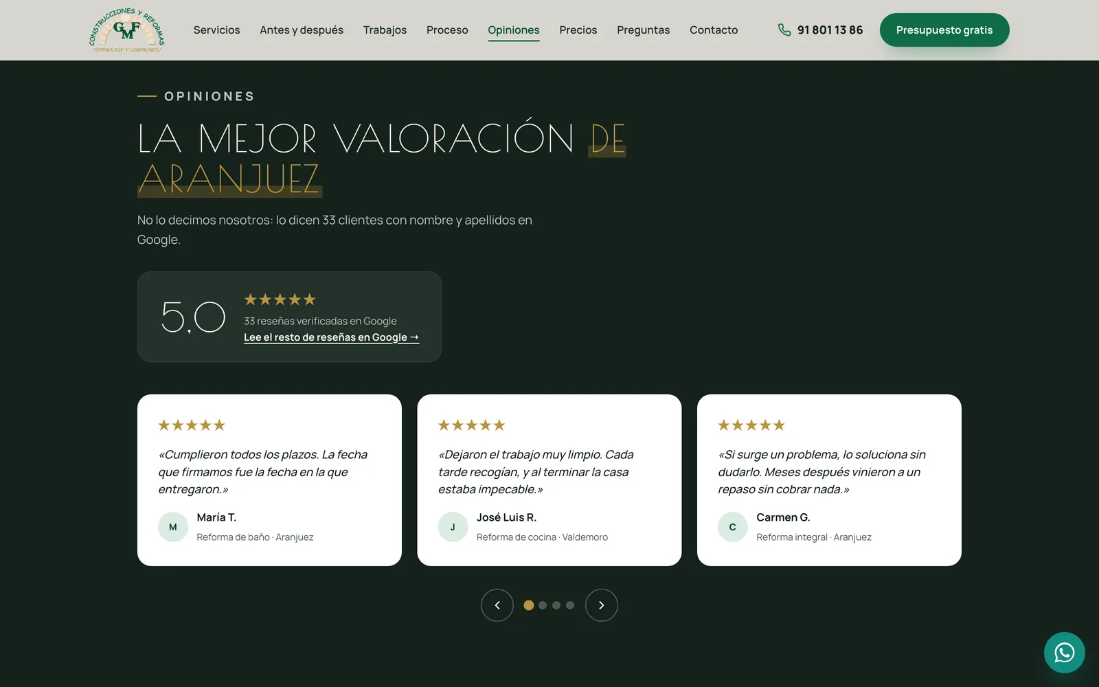
04 · The reviews, on a dark band with the Google score up front
Twelve real Google reviews, quoted with first name and initial, in a carousel with controls, with its state announced to screen readers, and which stops if the system asks for reduced motion. The score —5.0 across 33 reviews— sits in a card of its own with a link to the Google Maps listing, because a rating is only credible if it can be checked.
The section is dark on purpose. It is the only one on the home page that is, and that is why it stands out: Phase 1 designed it as the moment the page changes voice and the customer speaks.
index.html · reviews · js/main.js · carousel12 reviews · controls, announced state, paused under reduced motion
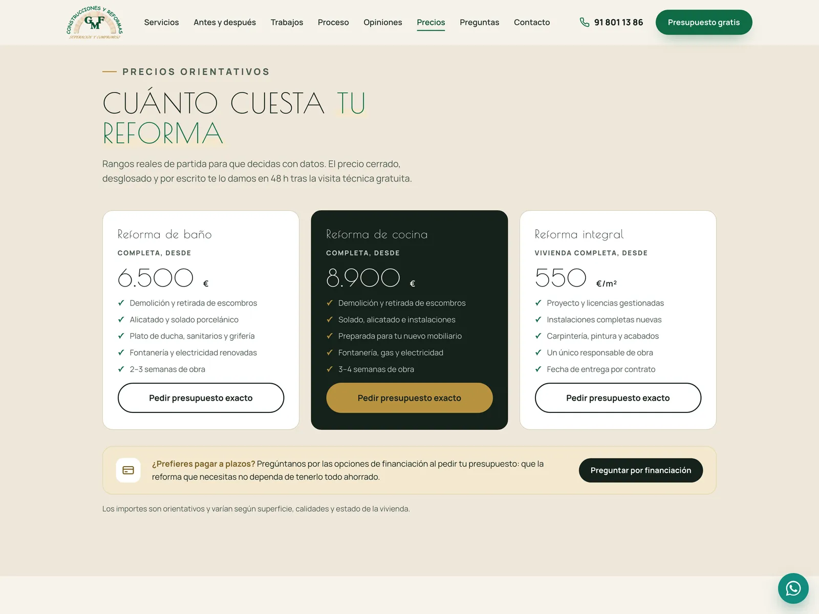
05 · Starting prices and financing, because nobody in the area publishes them
The audit listed it in the table of what a customer looks for and could not find: price guidance, “does not exist”; reviews, “does not exist”. Here there are three indicative ranges —bathroom, kitchen and full renovation— with what each includes and a clear note that the fixed price comes after the site visit. And a financing block, because one in three renovation customers would ask for it and, of the sixteen companies in the southern corridor the benchmark looked at, only one offers it.
The amounts are marked as provisional until GMF validates them; this page says so further down, under what is still missing.
index.html · prices3 ranges · financing · a note that they are indicative
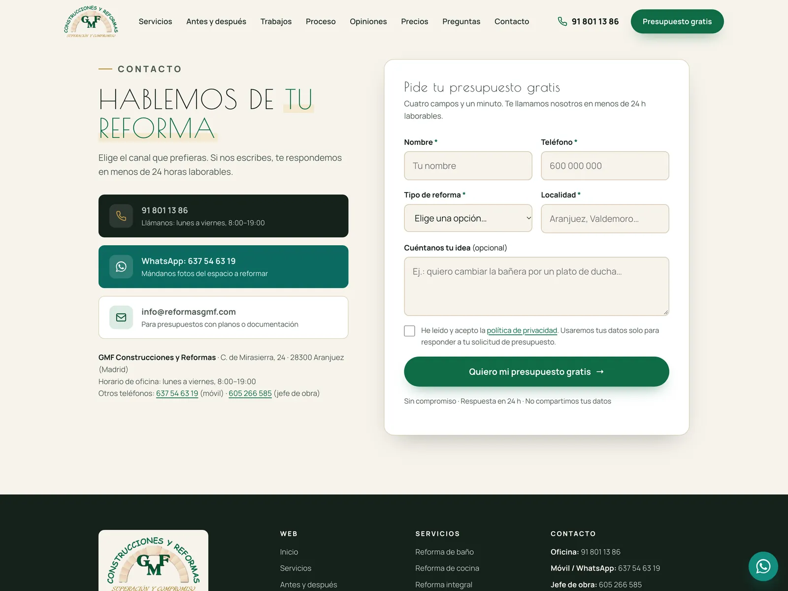
06 · A form that arrives, and knows how to say when it does not
Four required fields, an optional message and the privacy checkbox. The browser validates first and moves focus to the first error; then the submission goes by fetch to a single PHP file on the same host that validates everything again, because browser validation can be bypassed. If the server rejects a field, the error appears under that field, not in a generic message.
Against spam, three silent layers: an invisible honeypot field, a minimum of three seconds —no human fills four fields faster— and a cap of five submissions per hour and IP. The bot is told everything went fine, and nothing happens. Every request is also saved to a CSV in case the email fails, and consent is logged with date, policy version and a salted, anonymised IP: what the GDPR asks for and almost nobody does.
api · presupuesto.php · config.phpDouble validation · 3 antispam layers · GDPR log · CSV copy
07 · On the phone, which is where a renovation gets requested
Seven in ten visits to a renovation website come from a phone, and the audit described the previous site as “shrunk to mobile, not optimised for it”, so what got measured most was 390 pixels. A fixed bottom bar with Call, WhatsApp and Quote; a full-screen dark menu with those three channels always at the end; and a compact cookie notice that no longer covers the headline or the bar.
Two small decisions that show: on mobile the floating WhatsApp button disappears, because it was already in the bar and covered the buttons; and the header compacts between 961 and 1,520 pixels so that “Free quote” does not get cut off on a laptop. Version 6.1 also fixed a menu that the header's blur was clipping into a 76-pixel box: the first three links were off-screen and could not be tapped.
css/styles.css · v6 block · js/main.js · menuNo horizontal overflow at 390 px on any page
08 · The service pages, with the work on video
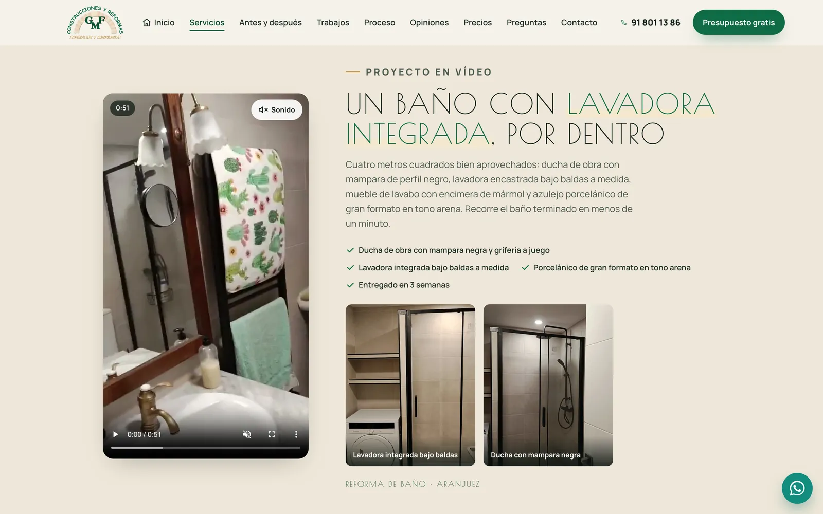
Each service has its own page with its preloaded photo, its “what is included”, its comparators, its gallery, its timings and its price. Two of them also carry site video shot by the team itself: a bathroom with a built-in washing machine, from the inside, and on the full-renovation page the same flat before and after, in two paired videos.
The videos play muted when they enter the viewport and pause when they leave; they do not start if the system asks for data saving or reduced motion; and the “Sound” button turns on the audio of one and mutes the rest. They come from WhatsApp originals run through ffmpeg: from 8 and 15 MB down to 3.9 and 4.9, with a poster taken from a frame of the video itself and VideoObject structured data.
_src/servicios.py · video key · js/main.js · videoPlays on entering the viewport · one sound at a time

Nothing loads without permission, measurement included
Out of the box, the site talks to nobody but Google Fonts. Tag Manager and Microsoft Clarity only load if the visitor accepts cookies, with Consent Mode v2 denied by default. What is there from the first moment is the audit's measurement plan, written into dataLayer: clicks on the phone, on WhatsApp and on the quote buttons —with the zone of the page where each happens—, outbound clicks to Google Maps, form start, error and submit, the confirmed conversion on the thank-you page and reading depth at 25, 50, 75 and 90%. When GMF pastes its IDs, not a line will need touching.
What was checked before showing it
A renovation website gets opened on a phone, in the street, on mobile data. So performance is not a Lighthouse score: it is the hero photo being preloaded, everything else loading when it should, nothing jumping into place —a CLS of zero on every page measured— and static files carrying a year of cache, with the version number in the URL so a change shows up on day one.
Accessibility was measured with axe-core on all twelve pages, on desktop and on mobile, and came out at zero. Not through a final sweep: the contrast of every colour is computed from the tokens, focus is visible, touch targets measure 44 pixels, and the two components that usually fail —the comparator and the photo viewer— work with the keyboard and tell the screen reader what they are doing.
CLS
No page jumps while loading: every image carries its dimensionsPerformance on mobile
And 100 · 96 · 100 for accessibility, best practices and SEOMinimum contrast
The green on the paper reaches 5.5:1; the text gold, 5:1301 redirects
The old Google Sites addresses land on their new section, not on a 404Google does not notice the site has moved
The .htaccess forces HTTPS and www —a single canonical address— and redirects every old URL with a 301, accents included, to the page or section that now corresponds to it: “who we are” to the guarantees, “our work / full bathroom renovation” to the bathrooms page. The pages carry HomeAndConstructionBusiness structured data with the Google rating, opening hours and the ten towns, and the home page adds a FAQPage with the eight questions. The sitemap dates itself at build time.
A site under review that does not pretend otherwise
This is not published yet: it sits in a private, password-protected preview so the client can walk through it calmly and say what changes. What remains does not depend on the code. Still to be validated: the photo captions and towns, the job figures —“800 jobs”, “300 bathrooms”—, the four starting prices, the company name and tax ID in the footer and legal texts, the legal review of those texts, the names on the twelve reviews, the measurement IDs and the final recipient of the form.
In the meantime, each of those things is marked in the code and in the README, in brackets or with a checkbox, and the preview's form sends requests to the studio, not to the client, so it can be tested end to end without a test turning into a quote. When GMF signs off, publishing means copying the folder to the reformasgmf.com host and filling in one configuration file.
The whole preview weighs (v9)
Almost all of it is the site photos in three widths and two formats, plus the two videosConfiguration file
Recipients, sender and salt: the only thing that changes at launchVersions in one day
v6, v6.1 and v6.2: the mobile menu, “Home” on inner pages and the full-renovation videosBoxes pending with the client
Copy, prices, tax ID, legal, reviews, form, analytics and domainHow to show a website that is not public yet
The preview lives in a folder of this very portfolio, behind a PHP door: a password, a thirty-day cookie and an Apache rule that lets no request through without it. Eight failed attempts block the IP for a quarter of an hour. The pages carry noindex and a header that repeats it, and the folder is barred in robots.txt. The client sees the site on a real domain, with its form working, and nobody else finds it.
The site, running
Below is the whole site, in the usual frame. The first thing you will see is the door: type the password and the frame loads the home page. Drag a comparator, filter the gallery, open a photo full size and try submitting the form with an eight-digit phone number.
And use the control at the top right: set the frame to phone size and you will see the fixed bottom bar appear and the full-screen menu. There is no scaling; it is being handed a different width.
This copy is the real version 9, the latest after the content review with the client, with the data GMF has not yet closed: prices, job figures and legal texts are provisional, and the site says so where it matters. The form works end to end, but while the review lasts the requests go to the studio, not to GMF. Without the password, the frame stays at the door.
Hand-written HTML, CSS and JS · PHP for the form · 70 KB of CSS and 31 KB of JavaScript · 0 libraries
Where it comes from
This is the third case study for the same client. The first is the digital audit: four blocks, thirty findings and the sentence that sums it up —the best reputation in town and the worst website on the market—. The second is the identity: the logo, the green, the stone of the arch and the gold of the motto, which this site inherits as they are. Between those two and this one came Phase 1 in Figma, the high-fidelity UX/UI design the client approved.
Doing all three changes how each one is done. Whoever writes an audit knowing they will implement it stops drafting recommendations and starts drafting things that can be finished; and whoever draws a brand knowing they will code it draws it in tokens. The result is a website with nothing in it that was not decided beforehand, and a preview where the client can check, button by button, that what a report promised is there.
Next in Front-end development
Retina · GAME TV — interface rebuild in Next.js